
Best fit
Who should use this template
Designed for tech and product, with a strong fit for these fields and career stages.
TechProductDataEntry levelProfessional
Resume/CV template guide
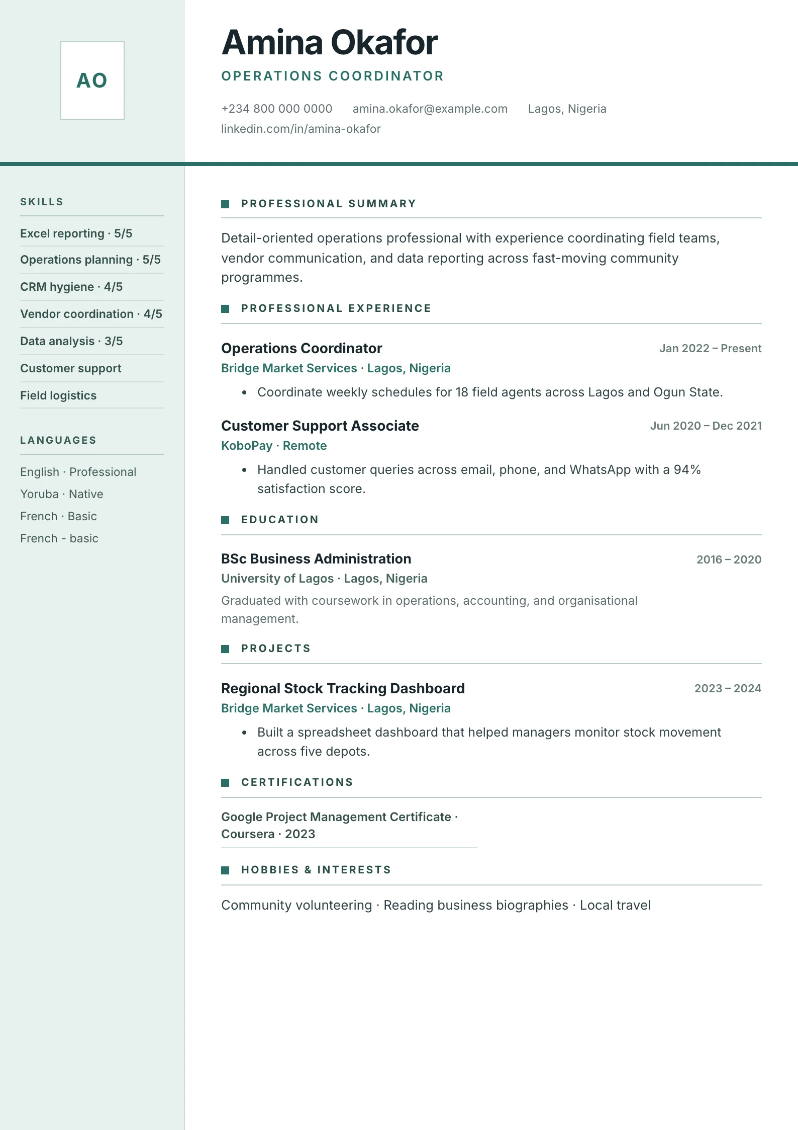
A technical two-column layout with skill bars, language levels, certifications, and project detail.
Two Columns separates supporting proof from the main career narrative. Technical skills, languages, and certifications stay easy to find while experience and project outcomes receive the wider reading column.
Format strengths
Use this structure when its hierarchy supports the evidence you need a recruiter to notice first.
Best fit
Designed for tech and product, with a strong fit for these fields and career stages.
Use it carefully
Detailed template analysis
Two Columns works when the narrow column contains compact reference information and the wide column carries the career argument. Contact details, core skills, languages, certifications, and concise education can sit in the sidebar; summaries, experience, and projects belong in the main reading path. This division helps recruiters scan supporting qualifications without interrupting chronology. It fails when narrative content is forced into the narrow column or when critical evidence is split between two competing paths.
Prioritize the main column first. Write recent roles and achievements as if the sidebar did not exist, then use the side area to remove repetition and expose verifiable supporting details. Skill labels should be short enough to wrap cleanly, language levels should be honest, and certification names should remain readable. If the candidate has many licenses or a long academic record, reduce the sidebar list or move detailed credentials into the main flow.
A two-column design needs more testing than a single column because visual order and extraction order can differ. Copy the exported text into a plain editor and check whether the main experience remains understandable. Do not place names, dates, or required contact details inside icons. Standard headings and a true text layer matter more than the number of columns, but a strict portal may still be safer with Minimal or Classic.
Check every generated page, not only the first. The sidebar background should continue cleanly, the main content should retain consistent margins, and no heading should be isolated at the bottom. A long sidebar can create unnecessary extra height, so remove weak skills and outdated certificates before reducing type size. The finished page should feel intentionally divided, with one dominant reading path and one supporting reference area.
Content priorities
The visual format earns attention only when the most relevant evidence appears in the right sections.
Group languages, frameworks, platforms, and tools instead of presenting one undifferentiated list.
Explain the problem, your contribution, the stack, and a measurable product or engineering outcome.
Connect implementation work to reliability, users, revenue, speed, quality, or team delivery.
How to use it
Keep the structure useful, replace every example, then test the final file as a recruiter would see it.
Keep the sections that support your target role and remove irrelevant placeholders.
Replace sample text with accurate tools, scope, achievements, education, and links.
Check hierarchy, dates, spelling, and page length before exporting PDF or DOCX.
Template FAQ
Many modern systems can, but parsing quality varies. Keep headings standard, text selectable, and the reading order logical, then use a one-column template when an employer explicitly requests it.
Use it for concise skills, languages, certifications, and contact details. Keep achievements and detailed project evidence in the wider main column.
Use the layout as a starting point, then make every section specific to your next application.
Open the editor