
Best fit
Who should use this template
Designed for marketing and business, with a strong fit for these fields and career stages.
MarketingBusinessSalesEntry levelProfessional
Resume/CV template guide
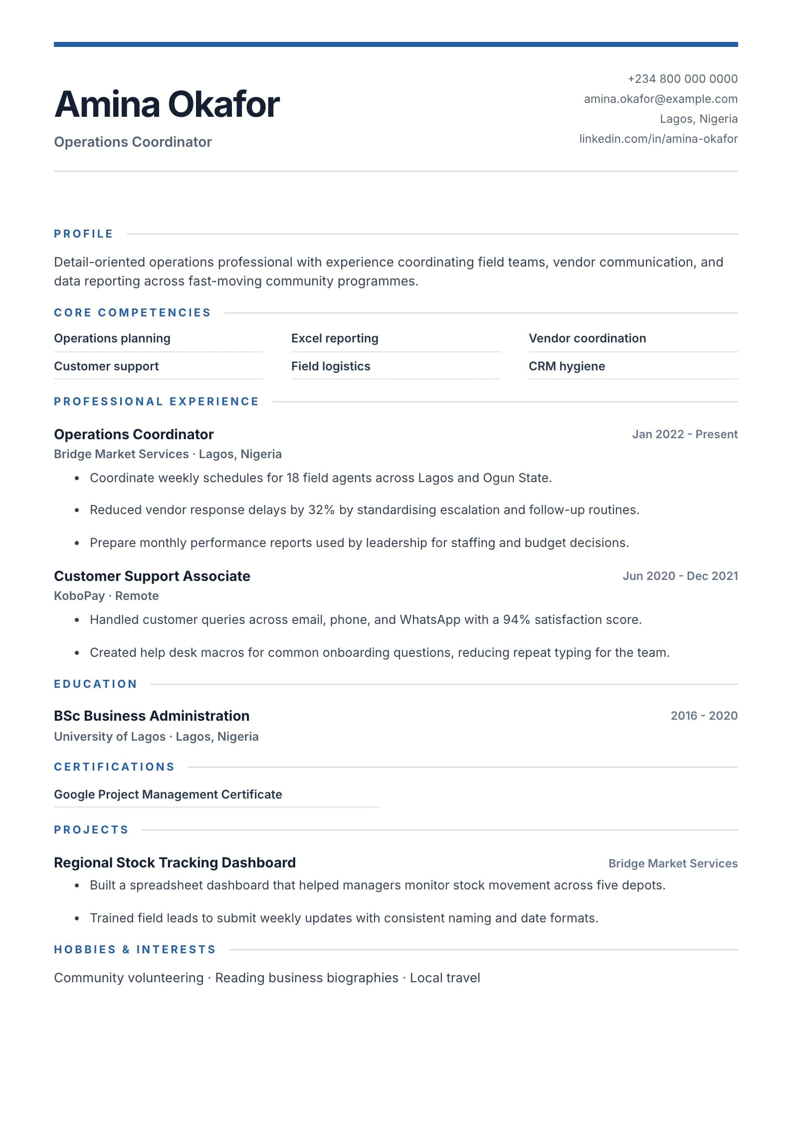
A bold blue header with core competencies, strong summary block, and clean achievement sections.
Modern Professional combines a confident blue header with a focused summary and visible competency area. It works best when your application needs energy and structure without becoming visually complicated.
Format strengths
Use this structure when its hierarchy supports the evidence you need a recruiter to notice first.
Best fit
Designed for marketing and business, with a strong fit for these fields and career stages.
Use it carefully
Detailed template analysis
Modern Professional combines a strong opening band with visible competency cues, making it suitable for business, marketing, sales, product, and operational candidates whose value spans several functions. The header should establish a precise target identity, while the summary explains the business setting and strongest result. Competencies are navigation aids, not claims by themselves; every prominent skill should be demonstrated later through a project, role, or quantified outcome.
Recent experience should still control the page. Use the visual accents to separate information, not to make all information equally loud. A campaign manager might foreground channel growth and budget scope, while an operations candidate could emphasize service levels, team size, and process improvement. Keep colors consistent, avoid skill ratings that cannot be verified, and make the first page useful even when the recruiter ignores every visual treatment.
This template works best with a curated skill set and concise bullets. Ten broad competencies, several badges, and dense paragraphs will weaken the hierarchy that makes the design useful. Choose capabilities that appear in the target vacancy and attach proof to them. If portfolio work matters, include one descriptive link and explain the candidate’s contribution in the relevant experience entry rather than filling the header with multiple destinations.
Test the exported file in grayscale and on a narrow laptop view. Section boundaries and text emphasis should remain clear without relying on color alone. Check that the top band does not consume space needed for experience and that no competency label wraps awkwardly. For conservative employers or strict application portals, compare the final draft with Minimal or Classic and choose the version that communicates evidence with the least friction.
Content priorities
The visual format earns attention only when the most relevant evidence appears in the right sections.
Use the accurate job title and one differentiating strength that matches the vacancy.
Choose six to ten skills that are directly supported by your projects and experience.
Lead with campaign, growth, customer, delivery, or commercial results.
How to use it
Keep the structure useful, replace every example, then test the final file as a recruiter would see it.
Keep the sections that support your target role and remove irrelevant placeholders.
Replace sample text with accurate tools, scope, achievements, education, and links.
Check hierarchy, dates, spelling, and page length before exporting PDF or DOCX.
Template FAQ
Yes, when the company accepts contemporary layouts. Keep the colors restrained, use standard headings, and make the work evidence more prominent than the design.
Six to ten focused competencies are usually enough. Prioritize terms found in the job description that truthfully match your experience.
Use the layout as a starting point, then make every section specific to your next application.
Open the editor