
Best fit
Who should use this template
Designed for design & creative roles, with a strong fit for these fields and career stages.
DesignCreativeTechEntry levelProfessional
Resume/CV template guide
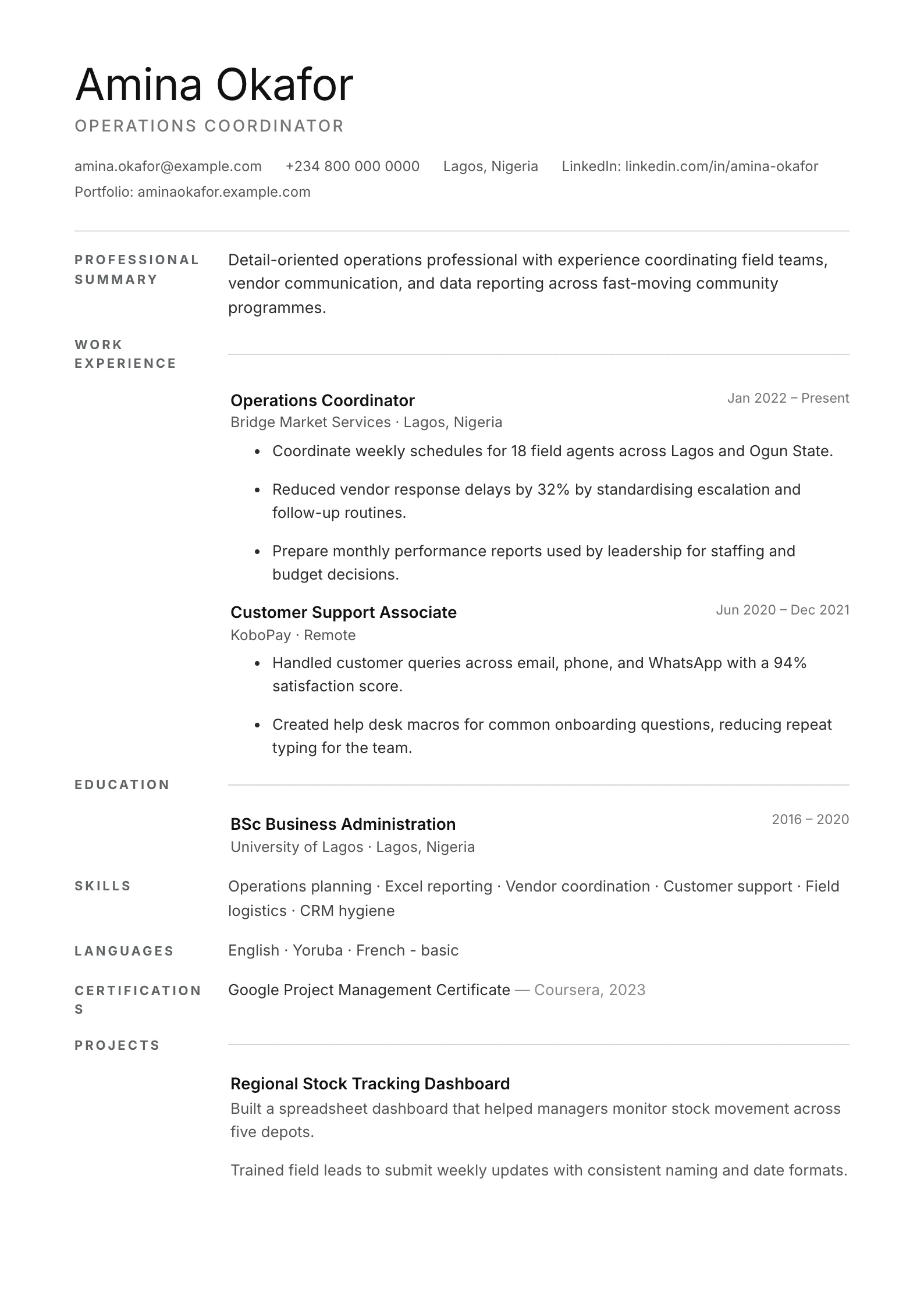
An ultra-clean single-column layout with generous white space, thin rules, and effortless readability.
Minimal removes visual noise so the reader focuses on role fit, achievements, and skills. The generous spacing is especially useful for candidates with focused experience who want a contemporary but conservative result.
Format strengths
Use this structure when its hierarchy supports the evidence you need a recruiter to notice first.
Best fit
Designed for design & creative roles, with a strong fit for these fields and career stages.
Use it carefully
Detailed template analysis
Minimal removes most visual competition, so differences in role scope, dates, and achievements become easier to compare. It is a strong default for technology, analysis, finance, administration, graduate applications, and ATS-led portals. The simplicity also exposes weak writing: generic summaries and repeated duties cannot hide behind styling. Give the page a precise target headline and make the first bullet under each recent role the strongest piece of evidence.
Whitespace should separate ideas, not create an artificially sparse document. Keep margins and line length comfortable while allowing enough room for context. Skills belong in a concise list supported by experience or projects. For technical candidates, name the stack in the skills section and explain how it was applied; for business candidates, connect tools and methods to decisions, service, accuracy, or commercial outcomes.
Minimal is not automatically the right choice for every short resume. A candidate with little experience still needs substantive projects, training, volunteering, or coursework rather than oversized spacing. A senior candidate may need stronger navigation across leadership, projects, and credentials. Add sections only when they answer a hiring question, and use another format if a sidebar or academic structure would make complex evidence easier to locate.
Inspect the final document for subtle consistency: heading case, date format, bullet punctuation, spacing between roles, and link styling. With few visual elements, these details define the quality of the page. Confirm that the exported text copies in order and that a second page begins intentionally. The result should feel edited and calm, not unfinished.
Content priorities
The visual format earns attention only when the most relevant evidence appears in the right sections.
Use two or three precise lines that establish level, specialty, and target contribution.
Keep bullets concise and connect each action to a result, decision, user, or business outcome.
List a focused skill set that matches the vacancy and appears in the supporting evidence.
How to use it
Keep the structure useful, replace every example, then test the final file as a recruiter would see it.
Keep the sections that support your target role and remove irrelevant placeholders.
Replace sample text with accurate tools, scope, achievements, education, and links.
Check hierarchy, dates, spelling, and page length before exporting PDF or DOCX.
Template FAQ
No. A restrained layout can look highly professional when the typography is consistent and the content is specific. Clarity is often more valuable than decoration.
Yes. It uses a straightforward one-column reading order and standard sections. You still need accurate keywords and an employer-compatible file format.
Use the layout as a starting point, then make every section specific to your next application.
Open the editor