
Best fit
Who should use this template
Designed for design & modern roles, with a strong fit for these fields and career stages.
DesignArchitectureCreativeMinimalEntry levelProfessional
Resume/CV template guide
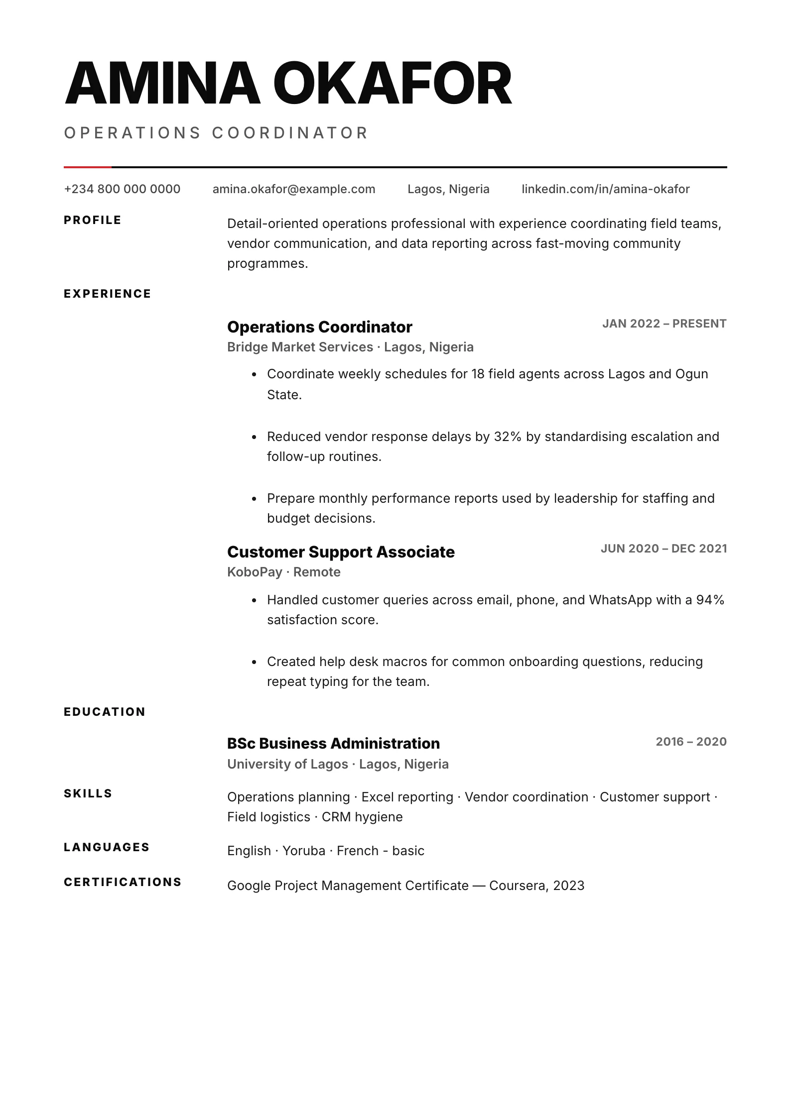
A bold typographic layout with oversized name, hairline rules, and a strict grid — clean and confident.
Swiss relies on oversized typography, precise rules, and a disciplined grid rather than decorative effects. It suits candidates who want a design-aware identity while keeping the page direct and evidence-led.
Format strengths
Use this structure when its hierarchy supports the evidence you need a recruiter to notice first.
Best fit
Designed for design & modern roles, with a strong fit for these fields and career stages.
Use it carefully
Detailed template analysis
Swiss applies a typographic grid, strong alignment, and restrained color to make information feel deliberate. It suits design-aware business, technology, architecture, consulting, and international applications where clarity is valued more than ornament. The grid should reveal hierarchy through spacing and weight: target role, summary, recent experience, and selected skills. Keep wording direct because the design gives every inconsistency a visible place.
Use short section labels and balanced line lengths. Achievements should begin with the decision or action and include enough context to understand the result. Avoid filling the grid with decorative coordinates, arbitrary numbers, or visual labels that have no hiring purpose. Portfolio links can be prominent for relevant roles, but they should be descriptive and accompanied by project evidence in the document.
Template samples are usually shorter and more predictable than a real career history. Test long employer names, multilingual qualifications, dates, URLs, and several-page output. Text must wrap within its column and maintain comfortable spacing. If content repeatedly breaks the grid, edit the content or choose a layout with more flexible tracks rather than forcing dynamic text into fixed dimensions.
Review the PDF at normal zoom and in grayscale. Alignment should remain crisp, section changes should be obvious, and no essential meaning should depend on color. Copy the text to confirm logical order. Swiss works when disciplined presentation matches disciplined editing; without that editing, the grid can make a crowded or inconsistent resume look more mechanical rather than more professional.
Content priorities
The visual format earns attention only when the most relevant evidence appears in the right sections.
Use a short target title and a concise statement that fits the strong typographic hierarchy.
Choose projects or roles that demonstrate judgment, process, collaboration, and measurable effect.
Link the portfolio and group methods, software, and specialist capabilities clearly.
How to use it
Keep the structure useful, replace every example, then test the final file as a recruiter would see it.
Keep the sections that support your target role and remove irrelevant placeholders.
Replace sample text with accurate tools, scope, achievements, education, and links.
Check hierarchy, dates, spelling, and page length before exporting PDF or DOCX.
Template FAQ
It applies principles associated with Swiss graphic design: strong typography, clear grids, alignment, restrained color, and functional hierarchy.
No. It also works for architecture, product, technology, and modern professional roles when concise communication and visual discipline fit the employer.
Use the layout as a starting point, then make every section specific to your next application.
Open the editor