
Best fit
Who should use this template
Designed for design & media, with a strong fit for these fields and career stages.
DesignMediaAdvertisingUXEntry levelProfessional
Resume/CV template guide
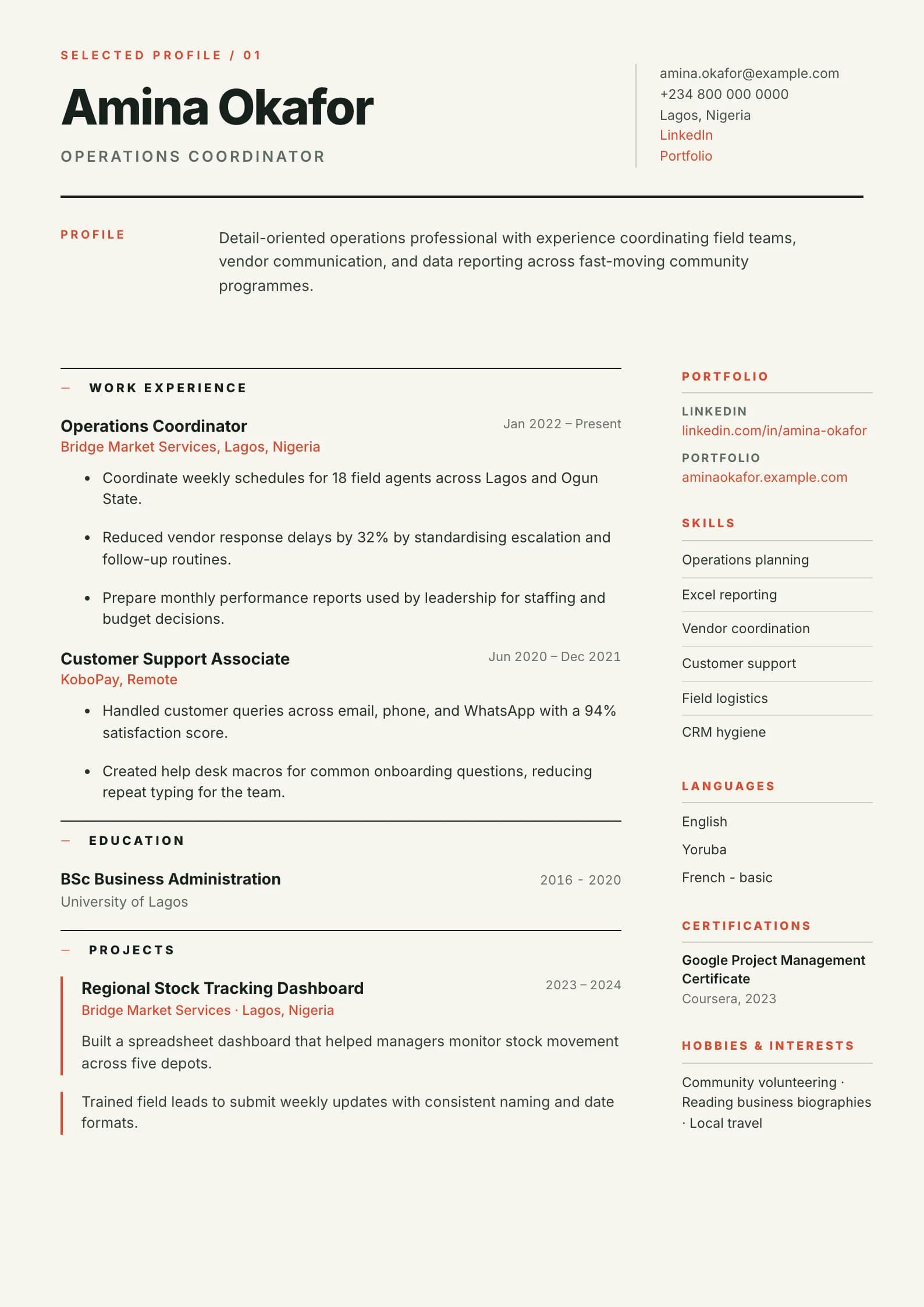
A teal gradient top bar, rounded skill tags, and a summary pill — fresh and modern for creative industries.
Creative uses expressive color, rounded skill tags, and a contemporary summary treatment. It is designed to complement a portfolio while still giving recruiters a clear view of role history and outcomes.
Format strengths
Use this structure when its hierarchy supports the evidence you need a recruiter to notice first.
Best fit
Designed for design & media, with a strong fit for these fields and career stages.
Use it carefully
Detailed template analysis
Creative is intended for roles where visual judgment, brand awareness, content, or presentation is part of the work. The resume should still explain the candidate’s role, collaborators, constraints, tools, and outcomes; a striking layout cannot replace that information. Use a controlled palette and a clear headline, then connect selected projects to business or audience results. Include one working portfolio link with a descriptive label rather than several unexplained icons.
Separate authorship from team output. A designer can describe the system, assets, channels, research, or production stages personally owned. A content professional can show audience, format, distribution, engagement, or conversion. A creative lead should add team and stakeholder scope. These details help employers evaluate professional practice, while the portfolio provides visual proof.
Some creative employers review portfolios directly, while others route every application through a standard ATS. Keep essential headings, contact details, employment, education, and skills as selectable text and avoid infographic ratings. If the layout uses a right-hand panel, verify the extraction order. Maintaining a Minimal or Modern version with the same evidence is sensible for portals that warn against complex formatting.
Review the Creative export at normal zoom and on a small screen. Color should not carry meaning by itself, long project titles must wrap without collision, and no decorative element should cover text. Remove visual devices that do not help the reader locate or interpret evidence. The result should feel authored for the target field, not like a generic resume placed inside an art template.
Content priorities
The visual format earns attention only when the most relevant evidence appears in the right sections.
Place a tested portfolio URL near the contact details and label the type of work it contains.
Explain the brief, your contribution, collaborators, constraints, and measurable result.
Group tools by design, research, production, analytics, or platform capability.
How to use it
Keep the structure useful, replace every example, then test the final file as a recruiter would see it.
Keep the sections that support your target role and remove irrelevant placeholders.
Replace sample text with accurate tools, scope, achievements, education, and links.
Check hierarchy, dates, spelling, and page length before exporting PDF or DOCX.
Template FAQ
No. One controlled accent palette is usually enough. The work samples and evidence should remain more memorable than the resume decoration.
Yes. Explain usability, conversion, engagement, production speed, audience reach, awards, or business results where they accurately reflect the work.
Use the layout as a starting point, then make every section specific to your next application.
Open the editor