
Best fit
Who should use this template
Designed for leadership & visibility, with a strong fit for these fields and career stages.
ManagementSalesMarketingProfessionalSeniorExecutive
Resume/CV template guide
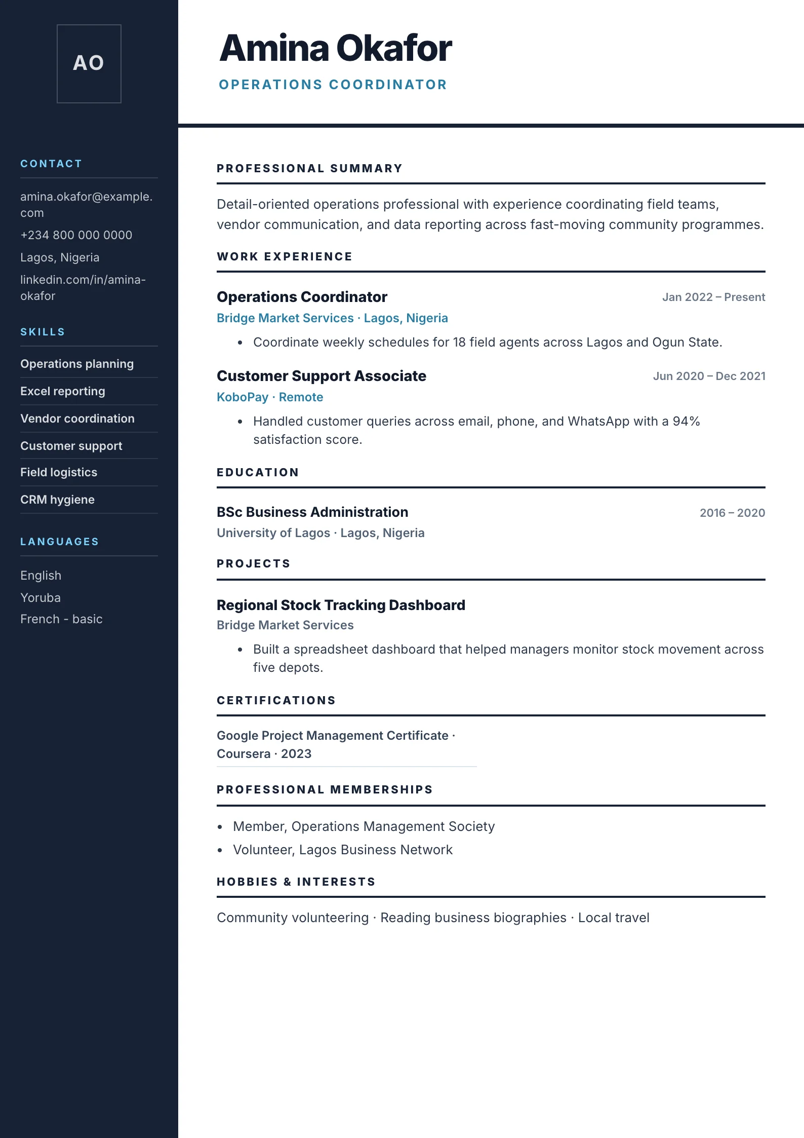
A wide dark sidebar with high-contrast navy, sky-blue accents, and a strong personal statement — built to stand out.
Bold uses high contrast and a wide sidebar to create immediate visual confidence. It works for candidates whose communication style and measurable commercial or leadership record can support a more assertive presentation.
Format strengths
Use this structure when its hierarchy supports the evidence you need a recruiter to notice first.
Best fit
Designed for leadership & visibility, with a strong fit for these fields and career stages.
Use it carefully
Detailed template analysis
Bold creates a strong first impression through a high-contrast side panel and prominent identity area. It works best when the candidate has a focused target and enough relevant evidence to justify that confidence. Put a precise role title under the name, limit the sidebar to high-value skills and credentials, and let the wider column carry the chronology. The contrast should guide the eye toward evidence, not become the main reason the resume is memorable.
Choose this format for roles and employers comfortable with visual personality, such as brand, sales, product, operations, or client-facing work. It can also suit experienced professionals who need a compact supporting column. For conservative public-sector forms, academic applications, or portals with uncertain parsing, compare a text-led version before submitting.
Dark sidebars magnify crowding and contrast problems. Long email addresses, LinkedIn URLs, and multilingual labels need explicit wrapping, while small light text can become difficult to read after printing. Use short labels, sufficient type size, and a limited number of skill items. Do not place essential dates, job titles, or achievements only in the colored region.
Inspect the document on screen, in grayscale, and as a printed PDF. Confirm that the side panel continues cleanly on later pages and that no content is clipped at the page edge. A second page should contain enough relevant material to justify itself. If the design feels heavier than the candidate’s evidence, switch to Modern or Minimal rather than filling space with weak content.
Content priorities
The visual format earns attention only when the most relevant evidence appears in the right sections.
Make one focused promise about the problems you solve and the evidence behind it.
Prioritize revenue, pipeline, growth, retention, market, or team results.
State team size, regions, stakeholders, budgets, or operating responsibility.
How to use it
Keep the structure useful, replace every example, then test the final file as a recruiter would see it.
Keep the sections that support your target role and remove irrelevant placeholders.
Replace sample text with accurate tools, scope, achievements, education, and links.
Check hierarchy, dates, spelling, and page length before exporting PDF or DOCX.
Template FAQ
Not when the color, typography, and spacing remain disciplined. The tone should match the employer and the content must remain more important than the design.
It uses selectable text and standard content, but two-column parsing can vary. Use a simpler alternative when the application explicitly requests an ATS-first format.
Use the layout as a starting point, then make every section specific to your next application.
Open the editor