
Best fit
Who should use this template
Designed for corporate & finance, with a strong fit for these fields and career stages.
FinanceConsultingCorporateProfessionalSenior
Resume/CV template guide
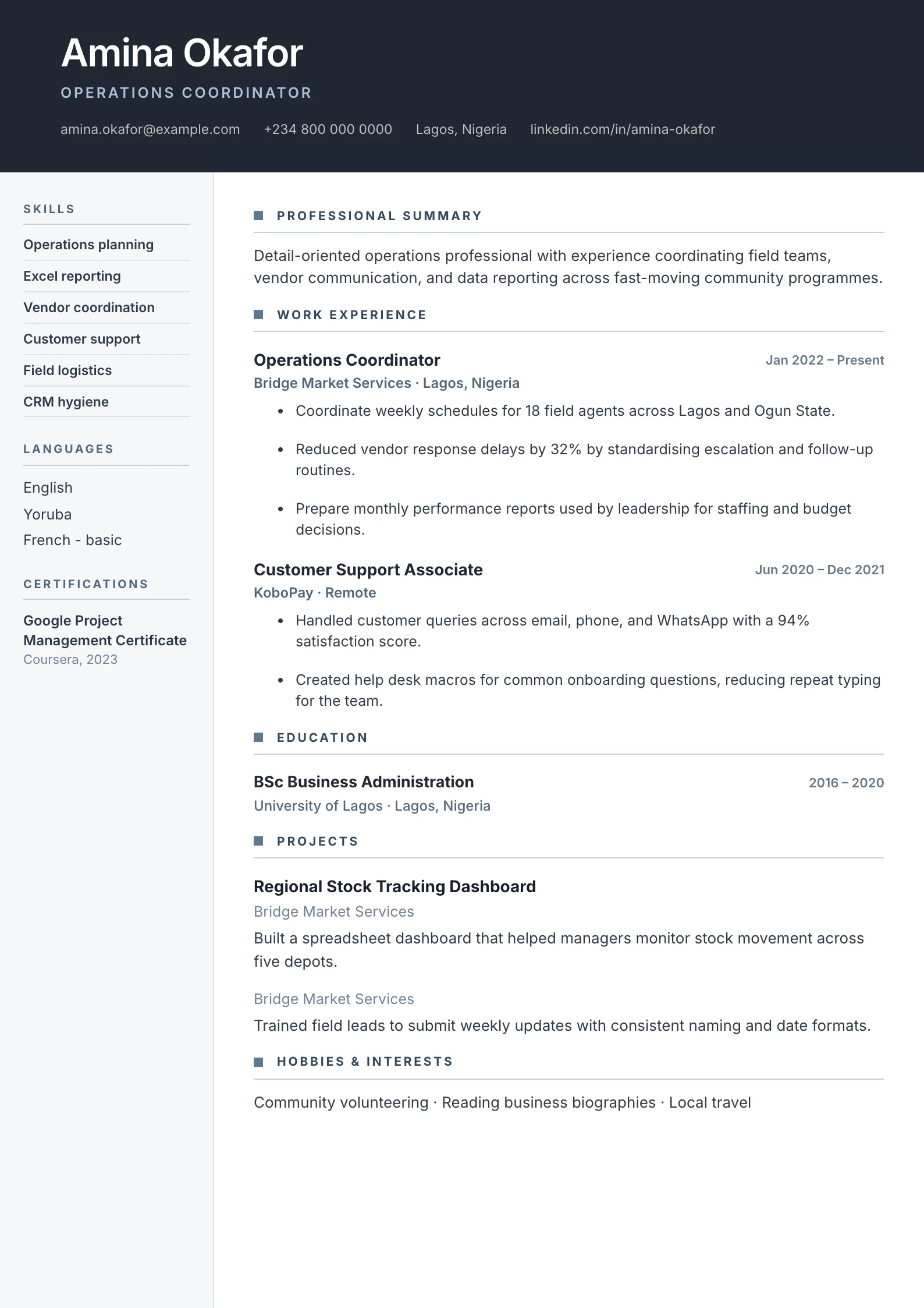
A dark header bar with a two-column body, blue accents, and a structured timeline — sharp and professional.
Corporate combines a strong dark header with a disciplined two-column body. It suits candidates who need to communicate commercial credibility, structured progression, and business results in a polished format.
Format strengths
Use this structure when its hierarchy supports the evidence you need a recruiter to notice first.
Best fit
Designed for corporate & finance, with a strong fit for these fields and career stages.
Use it carefully
Detailed template analysis
Corporate is suited to candidates working with formal reporting lines, cross-functional teams, customers, vendors, controls, or repeatable operating processes. The strong header and side reference area can communicate level and specialization quickly, while the main column explains business contribution. Use language that shows how work affected revenue, cost, risk, service, quality, delivery, or decision-making rather than relying on internal company jargon.
Recent roles should state the organizational setting and scope before listing outcomes. A project manager might include budget, regions, stakeholders, and delivery stage; an HR professional could show workforce size, hiring volume, employee programs, or compliance; a finance candidate should connect reporting and controls to accuracy and business decisions. Keep proprietary names out when confidentiality applies, but preserve enough scale for the reader to judge complexity.
The sidebar should remain a concise index of qualifications, systems, languages, and certifications. It should not contain long narrative or every skill acquired during a career. A dense sidebar can force extra pages while leaving the main column underused. Prioritize what the target employer is likely to screen and move supporting explanation into the relevant role.
Review the PDF as a recruiter and as an application system. Contact details and headings must be selectable, the reading order should remain understandable, and colored backgrounds need sufficient contrast. Check every page for consistent side treatment and margins. For a small startup or highly creative position, Modern or Creative may better match the setting; for strict portals, Minimal provides an even simpler fallback.
Content priorities
The visual format earns attention only when the most relevant evidence appears in the right sections.
Summarize sector knowledge, level, commercial scope, and the decisions you support.
Show progression, clients or business units, responsibility, and measurable impact.
Surface relevant finance, consulting, compliance, and systems qualifications.
How to use it
Keep the structure useful, replace every example, then test the final file as a recruiter would see it.
Keep the sections that support your target role and remove irrelevant placeholders.
Replace sample text with accurate tools, scope, achievements, education, and links.
Check hierarchy, dates, spelling, and page length before exporting PDF or DOCX.
Template FAQ
Use accurate titles, clear dates, measurable business outcomes, recognizable systems or qualifications, and concise explanations of scope.
Yes, but graduates should replace an executive-style profile with education, internships, projects, and analytical or client-facing evidence.
Use the layout as a starting point, then make every section specific to your next application.
Open the editor